-
Attention is a hot topic, using Augmented Reality reveals a lot about how consumers respond.
-
Tracking attention in 3D reveals what consumers do with packs.
-
On shelf a pack naturally needs to draw attention and also say something but the message must be simple.
-
In hand the pack must explain the product efficiently using accessible information ordered in an easy to understand way.
-
With packs, like with all brand communications, it’s not about getting all the attention and using it, it’s about using all of the attention you are getting.
The Attention Economy is a hot topic in the world of ad testing, but how does it relate to packs? The ad-scape is getting ever busier, and packs have always had to compete in one of the most attentionally demanding environments. Understanding how consumers focus their attention on and around packs is and has always been as important.
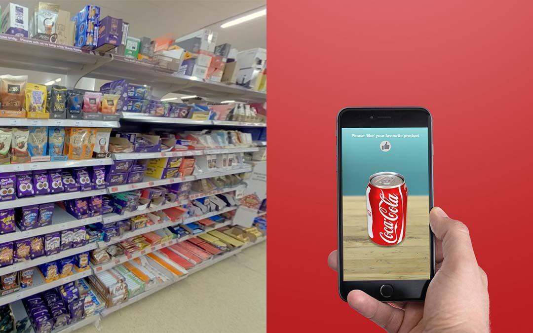
Our Augmented Reality (AR) methodology for testing realistic 3D packs allows us to accurately measure consumer attention and our behavioural data has revealed some intriguing insights. So, what have we learned about attention to packs in the FMCG category?
On shelf it’s not only about getting attention, but also using attention efficiently.
Often, we have found that a key client focus is whether they can be seen on shelf. This is of course important, but grabbing attention is only part of the story. Using attention efficiently is equally important. If you are using it properly you may not need as much attention as you think.
Colour, colour, colour – used in the right way of course
We have seen several ways in which packs draw attention naturally. We know solid blocks of colour are attention grabbing, as long they are different to the competitors that sit on shelf with them. A bright red pack won’t work if all the competitors are red. Similarly, a pack that has high contrast on it, such as a bold black and white pattern, attract attention. We have seen large text and even faces are natural attention grabbers. But just because visual attention is drawn, it does not automatically mean that processing happens. You not only need to get attention, you also need to use it.
Think what would happen if a plain white pack with single flashing light were on shelf. It would score very highly on our attention index, but it would communicate nothing about the product. On a visually busy fixture the attention a pack gets must be used. A pack on shelf may only get a simple fixation so it needs to efficiently communicate something, even if it is very basic, to get to the next step of the pack being picked up.
Familiarity has a big advantage, new packs need to combat that
Most packs/brands will be known to the shopper, so when looking they will have a mental image of the pack they are searching for. They then pattern match with what they see. Making packs easily recognisable, therefore, is beneficial. Good brands have unique brand assets such as strong logos, images, graphics and even shapes and colours that efficiently communicate who they are. The task is different with packs that are new to the consumer. In this case attention must be attracted and simple devices making the product appealing should be used to make the consumer want to investigate more.
Fonts and text make a big difference
Some of the barriers we see to using attention efficiently are text/background ratios where the contrast makes the text unclear. If the text is over an image this, too, can break up the letters and make text harder to read. Florid fonts can look great but are harder to read and do not use attention efficiently. Being able to instantly read the text, if that is the key communicator, is important. Size of the elements is important, and they must be visible from at least a metre. We have seen complex logos, images and even product shots that the consumer passes their attention over, simply because there is too much to process at that distance. It’s also important to remember nearly 75% of people do not have 20:20 vision.
With pack in hand, efficient communication is key
When the pack is in hand, the most common thing we see is consumer’s visually interrogating the pack to find out what the product contains. Think of it as the consumer wanting to answer the question ‘What’s in it for me?’… in this case, literally!
We see consumers looking for the information that tells them about the product, and so they shift their attention around to find what they need. This is shown very clearly when tracking attention in 3D as we do in our apps, DiscoverAR and DiscoverVR.
Simplicity, always
The packs we see perform well are those with simple attentional aids such as logos, simple images and short test phrases. These allow the consumer to spend little attentive effort but maximise on pack information understood. Long form text should be avoided, if possible, but if it is included a clear, readable font is advisable. One pack that had a long form of user instructions using a small handwriting font in light blue, on a light brown background. Although it looked nice and homely this example performed particularly badly.
Layout is also important. Knowing the information consumers look for can point to an information hierarchy. You can then place those elements either near each other on a pack or create a clear path leading from one to another. How a pack actually functions can be important too. How it opens and closes or how it can be stored matters to consumers, and we see an increasing number of briefs about how recyclable packs are. Communicating this clearly can be information that is attended to by consumers.
We often find simpler is better. We know how much time packs are ‘examined’ and by tracking attention in 3D, we see how much effort consumers are willing to make and how easy it is to lose their attention.
Think fluency
We consistently see that allowing people to gain maximum output with minimum attentional effort always leads to better outcomes. One idea we are increasingly using is the idea of ‘fluent processing’. This is the ability for a pack to both visually and conceptually efficiently communicate what it needs to.
Packs that can be ‘fluently’ processed are commonly the ones that are preferred. This matches the psychology that shows that fluently processed stimuli, even if new, are considered more familiar. They are liked more and are even believed to be more truthful.
Of course, aesthetic considerations are always going to be important. We have found, using our 3D AR packs, that respondents even have an angle they think the pack looks best from. But a pack can be both beautiful and communicate well.
Overall, we have found the main thing for a pack on shelf is to get seen, then get a key, simple message across. Even if it’s just “I’m the brand you were looking for”. When in hand a good pack allows the consumer to efficiently find the information they need. When design over substance inhibits people’s ability to understand the pack, they can all too easily shift their attention elsewhere. But give consumers simple, attentionally efficient devices and we see better outcomes. As we say with attention economy, it’s not about getting all the attention, it’s about using all the attention you get.
Recent Comments